|
|
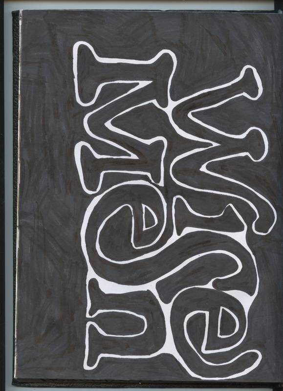
I drew this sketch in my sketchbook, I like this sketch because of how well the just using sharpie works with the typography. I like how the S and E connect to form one letter but it is still eligible. The main reason I chose to do this was to add an artistic touch and to save space.
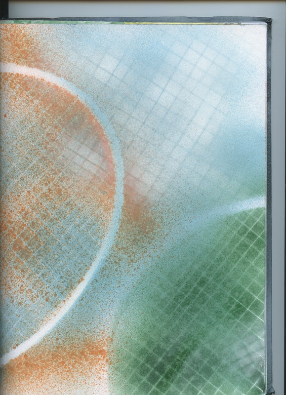
I like this sketch in my sketchbook because of the abstract parts of it. I used spray paint and an old badminton racket to create the square parts and the white circles around the edge. This design does have a 2nd half on its neighboring page but I couldn't fit both on the scanner.
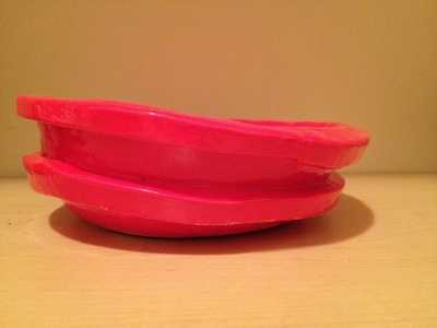
This was my first attempt at a bowl structure for ceramics one. I used a medium sized plaster and couldn't think of what I wanted to do so I put stripes on the bowl and was originally going to make red and white stripes like a wheres waldo theme. Once I started glazing it though I spilled red on the stripes and decided just to go with it and glaze the whole thing red.
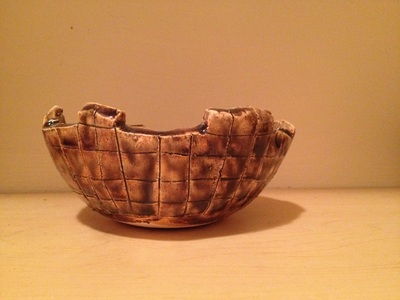
This was my second attempt at a bowl structure for ceramics one. I used a smaller sized plaster for this bowl and originally was trying to make a castle themed bowl but I couldn't find any dark grays so I decided to go with a brownish color and mix it with a light gray.
This is my first mug. It took me several tries to get this far, I wasn't sure what I wanted to do for my design so I decided to do a diamond pattern along the side of the mug.
|
|
|
 |